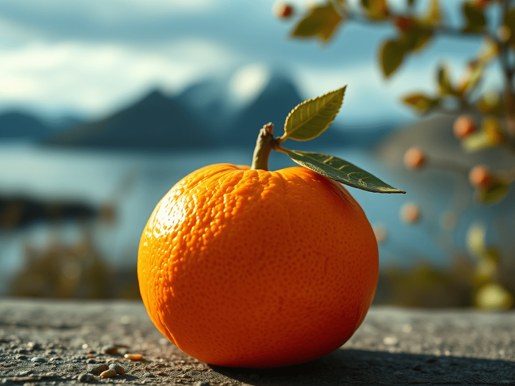
And it’s not about a Scandinavian fruit!
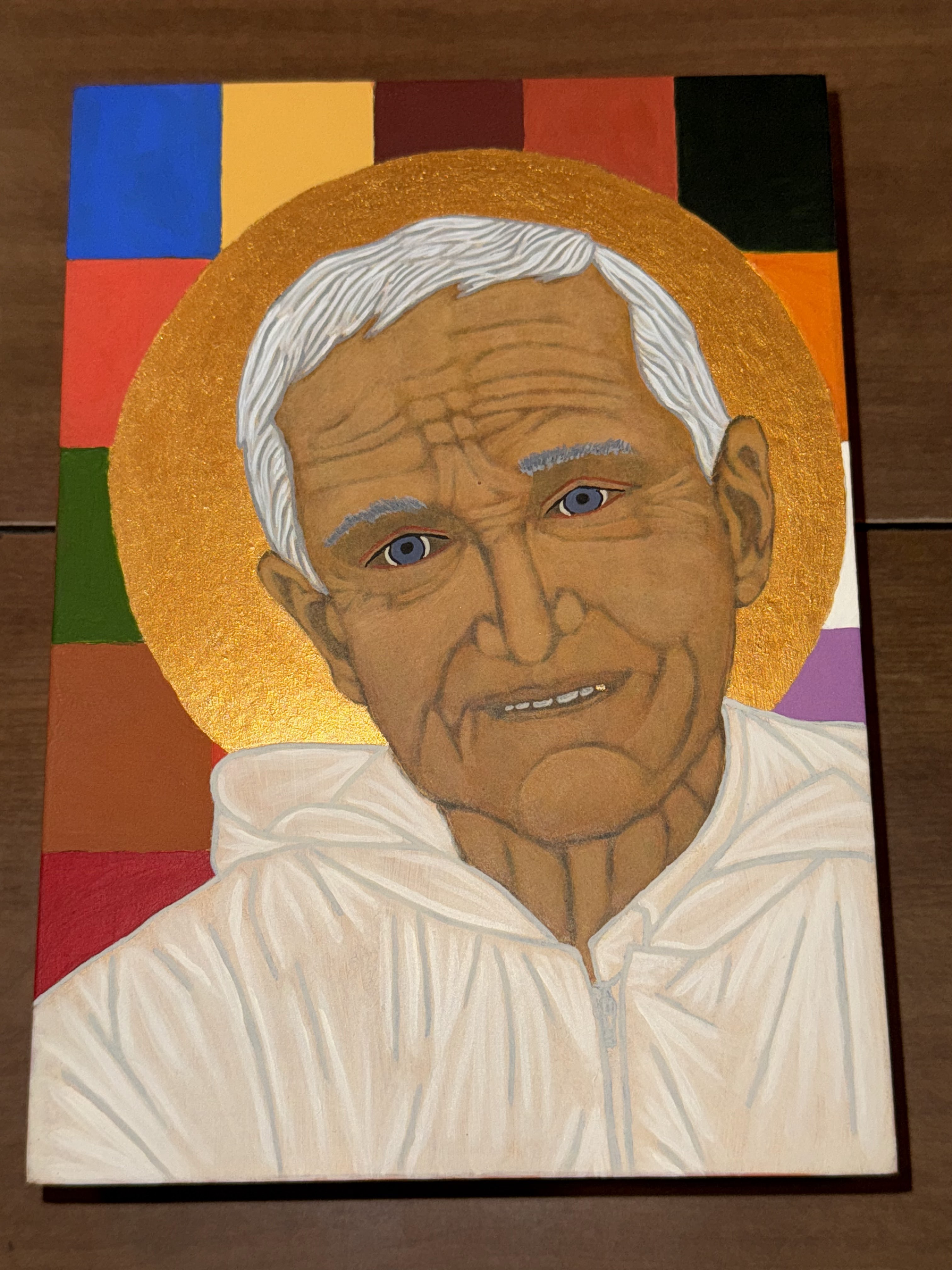
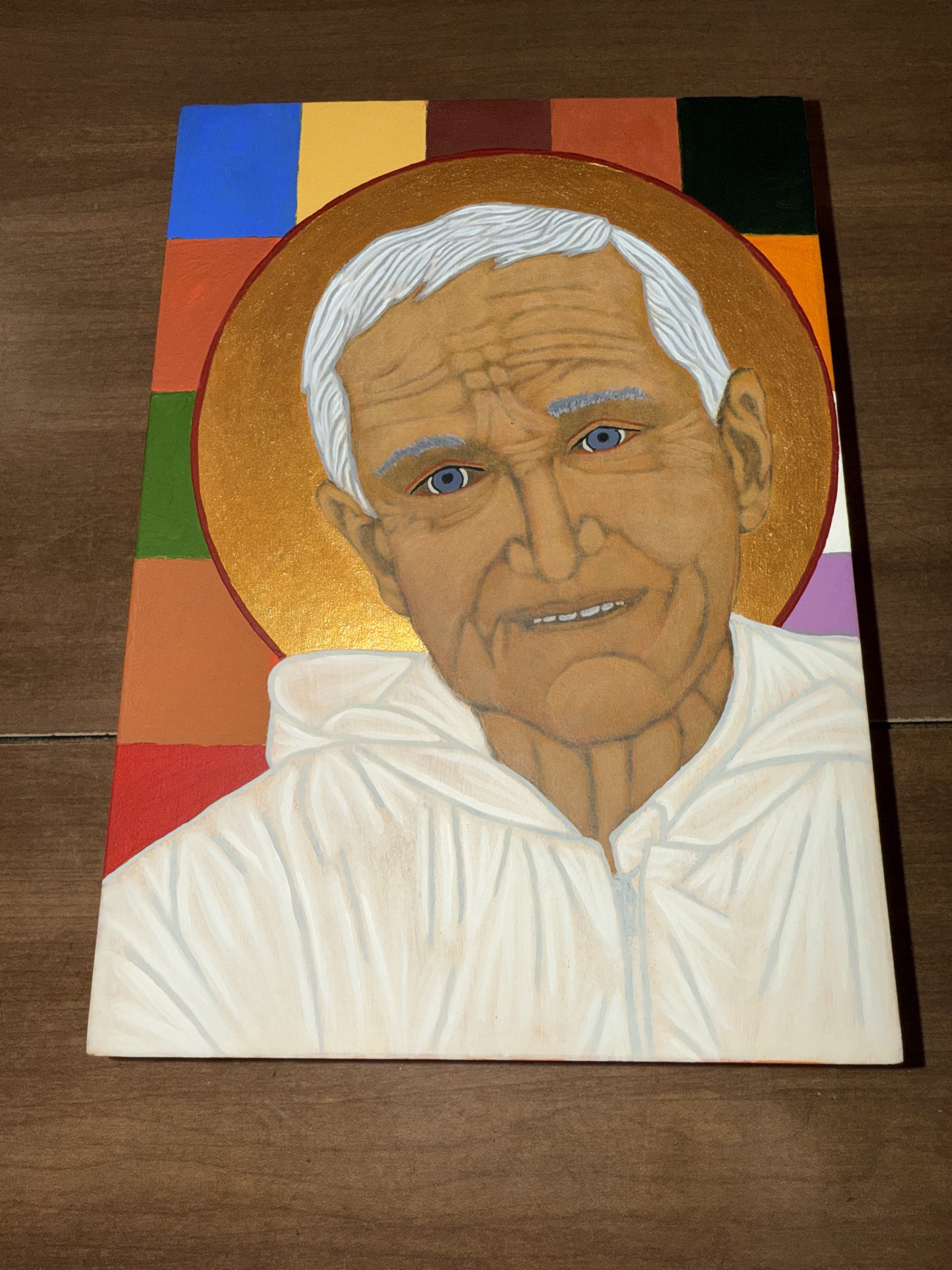
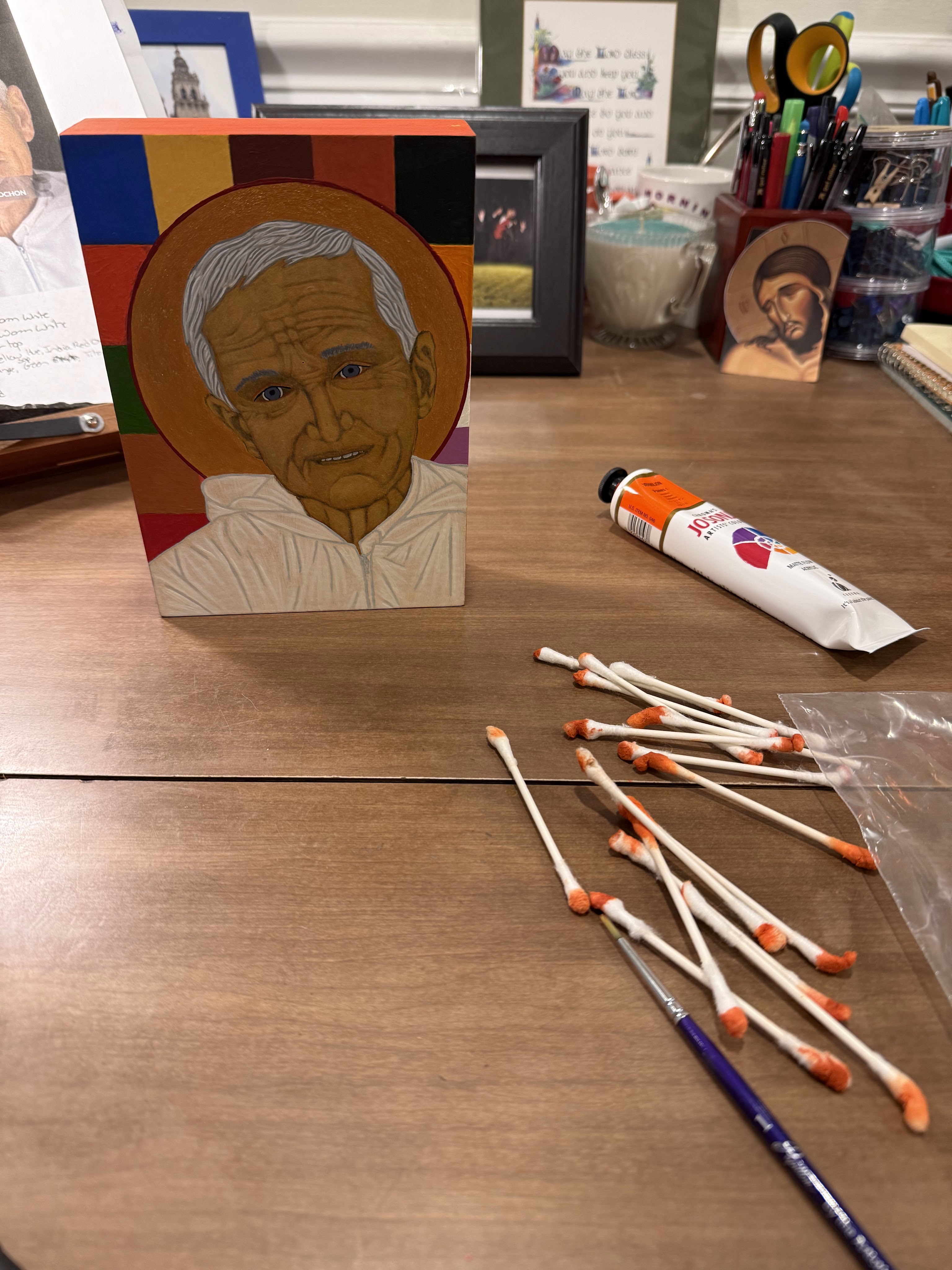
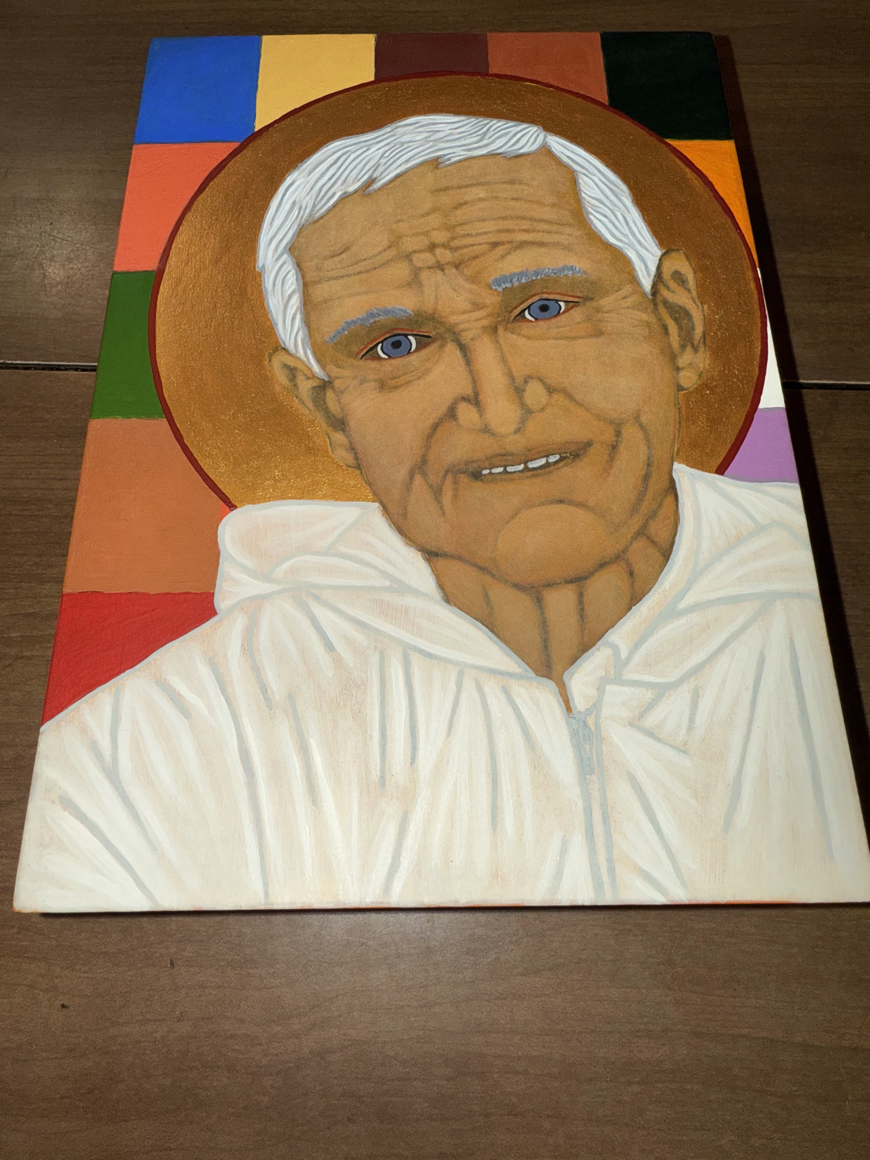
Last week, I spent a some time painting and praying with an icon of Br. Roger of Taizé I’ve been creating for a friend since last summer. It’s been so much fun to work on as I’ve never used a photograph as the basis for an icon before. I’ve been trying to finish it before the baby arrives because I know time will soon be scant for crafting!
I was very close to finishing, having done most of the final details and outlines. That evening, I painted the halo outline in Brown Madder, a bright red hue, but I needed to do some touch up on a couple of places where the red had gotten a bit out of hand. I worked on the Rich Gold of the halo and turned my attention to the color blocks of the background behind the halo.
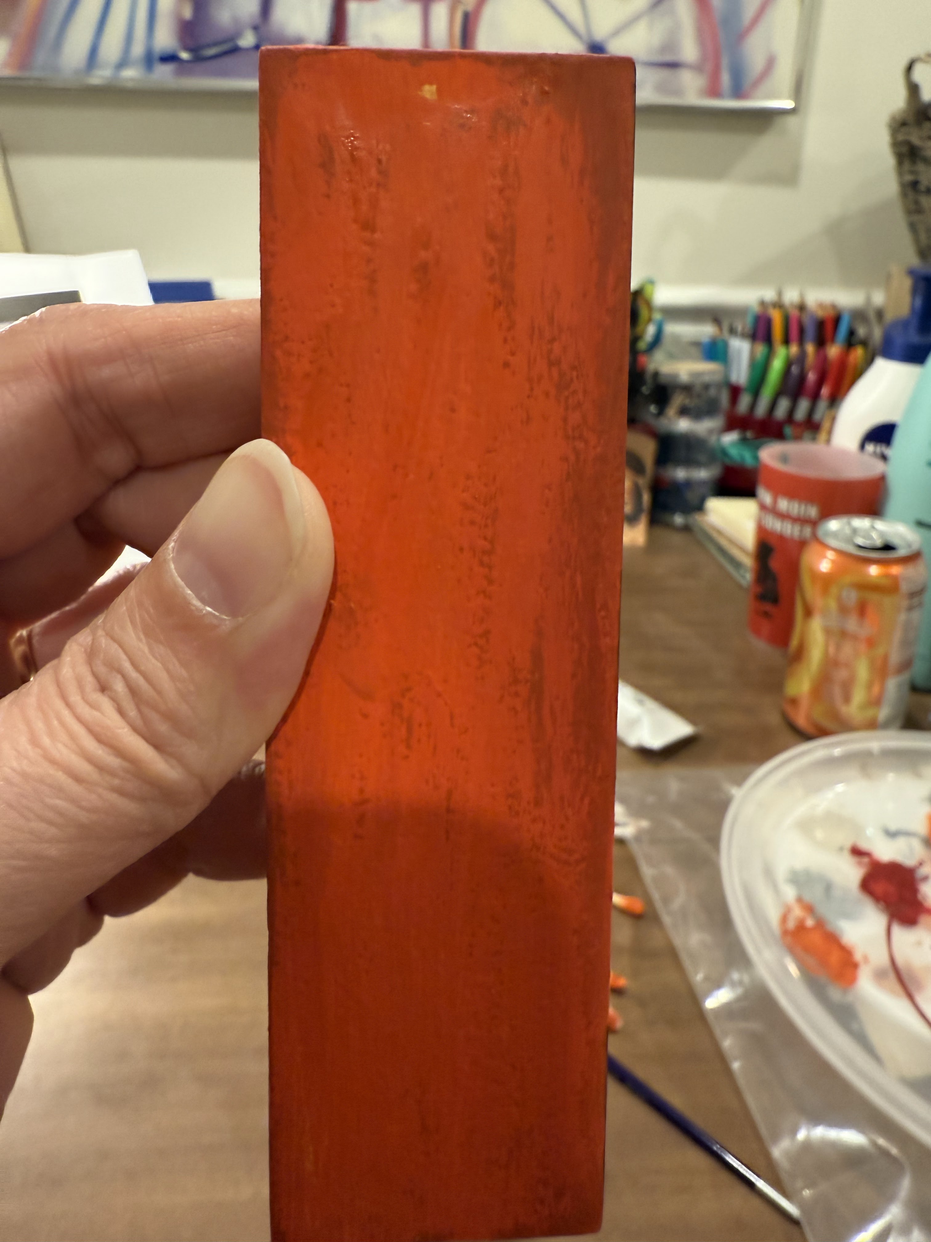
As I applied Norwegian Orange, the bright Taizé color I used for a background block and on the border, it looked bluish to me and splotchy. Hmmm. Weird. Since I had worked with a few colors in doing touch-ups, I washed my brushes, got fresh paint water, and squeezed a new glob of paint out. Maybe something had gotten mixed in somehow. I started working and, still, it seemed strangely tinged with a blue undertone. I changed my water again thinking I hadn’t cleaned the cup well enough, got new brushes I hadn’t used that evening, and it still seemed bluish.
I thought perhaps I could try to paint some uneven spots on the top border of the icon while I was in touch-up mode. So I spread the paint on the top of the icon where I had seen some uneven places and it still seemed off color-matching wise. Now, it’s important to note that I hardly ever use orange when painting icons and I don’t have many orange paints in my collection.
I was getting concerned and frustrated, and I knew it was dangerous and unwise to push on such a state, so I finished up thinking I’d look in the morning with better light in my craft/prayer room. I took pictures at the end of my painting session as I always do (photographs create distance that gives me new perspective after staring at something up close for hours at a time). However, as I went downstairs and discussed the dilemma with Jeff, showing him the photos, I noticed it was a completely different shade than on previous photos. “It’s all wrong, Jeff! I was so close to finishing and it’s the wrong shade of orange!”
I knew almost immediately once I saw the photos that it was supposed to be Vermilion, not Norwegian Orange. Up the steps I trudged, knowing that I could not remain comfortably seated on the couch casually watching TV as the paint dried and became harder to remove. I got fresh water, sat down at my table, turned on the lamp, and set to work. From my painting bag, I grabbed a pile of Q-tips to wipe off the Norwegian Orange and repaint. Dipping each Q-tip into the fresh water, I gently rubbed the cotton tips on the areas I had painted, swirling carefully in circles until the Norwegian Orange released it’s grip and revealed the bright, reddish-orange Vermilion below.
I went through Q-tip after Q-tip, a pile of cotton swabs with dark orange tips growing on my desk. It was like magic, turning back time and revealing what I had covered up. And thank God it worked!!
I was so certain it was Norwegian Orange. I had been so excited to get to use a color I hadn’t really used before. I was so caught up in the excitement of being close to finished, I plunged on ahead. What was that saying, “haste makes waste”?
A couple of things I realized after the fact: I hadn’t made notes on the colors I had used as I went along, thinking I could visually match them later as I needed to. A few days earlier I had tried to jot down some notes so I could have them in my notebook in case I wanted to reference the colors or paint the icon again. As I did the touch ups, I realized that I was off on a few of my guesses/assumptions for the colors. Over the summer to get better organized for classes, I had also made color swatches of all the paints I own from Jo Sonja’s Artists Colors so I could easily reference them.
I had all the tools I needed, including my visual perception, and I still pressed on, stubbornly wanting it to be right and to make progress. It’s kind of like commenting on social media when we know in our hearts it won’t lead to anything good!
- Have you ever insisted on moving forward or pushing through without pausing to consider what was going on or whether or not you should continue or make a change?
- Have you ever pressed on, in spite of that gnawing feeling in your stomach, hoping it’d all just turn out okay?
- When are you most likely to ignore the signs that something is not quite right?
- What helps (or what does it take) you to slow down, pause, or reconsider?
- What emotions does admitting your mistake to yourself and/or to others bring up for you?
- How easy is it for you to jump in and start again – either fixing the mistake or starting from scratch?
- How do you feel as you begin again and as you see things head in a better direction?
- Where does God show up in this process?
These kinds of mistakes can absolutely drive us up a wall. They can also serve as great teachers if we take the time to consider what was at work – perhaps what assumptions, patterns, and desires were at play – as we decided to keep going.
So once the initial frustration and sadness pass, may you chuckle at yourself, be honest about what happened, and try, try again.
Orange you glad we have our whole lives to practice this stuff?
© Annabelle P. Markey

Leave a comment